"Art is my vehicle through life; may we share the ride together." Ron Wickersham
Showing posts with label stamping. Show all posts

Thursday, April 30, 2020

Mixed media cards


Yesterday I decided I wanted to get inky so I made a master board on watercolor paper. What's a master board? You make one large piece of art and then cut it up into smaller pieces and further embellish. Years ago when I first started card making it was called "one sheet wonder!"

I used two colors of green Distress Inks and one blue one, swiping them on my craft sheet and spritzing with water. Then I "smooshed" the paper into the watery color several times, repeating as needed to fully cover the paper and drying between each step.

Once I had achieved some pretty color, I stamped some script and numbers with black Archival ink. I also added some heavy white gesso through a number stencil and splattered watered down gesso over the cards.  The final touches were adding white floral die cuts (Tim Holtz) and some word strips (also TH). Then I edged the card fronts with black ink and mounted them on white cards.

I love how they turned out and had fun getting messy again!

Tuesday, March 3, 2020

Art day and pretty cards

Last week two of my friends and I got together to make some cards that one of them had designed and prepped for us. We had a great day of friendship, eating and crafting. These are the cards we made.


Embossed backgrounds, Stampin Up stamps, watercolor, Stickles
same floral stamp as above


napkin collaged on watercolor paper, Stickles


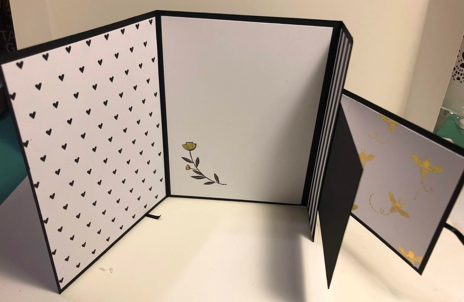
heat-embossed beehive, Stampin Up stamps, card unties and then opens to reveal  the small
notecard on top and a tri-fold below


inside of above card - love the gold patterned paper


Sunday, February 23, 2020

February Steampunk-themed Altered Trading Coin Swap

The theme for the February altered trading coins swap is "steampunk."

These are the coins I created and sent off to my partners. 


I used a painty background and stamped the woman's face on a piece of ivory yardstick and lightly colored it with colored pencils. I added it to a painty background and glued on lots of metal gears.
I made the turquoise and rusty red ones by using alcohol inks to some of the silver ones. I edged the coins with a copper pen.

I think steampunk is a hard theme so I can't wait to see what I receive in return?

Saturday, May 12, 2018

Revisiting Altered Books

I have made a few altered books before, but about a month or two ago I discovered a new (to me) mixed media/altered book artist, LorriMarie Jenkins, on You Tube.  I have been binge-watching her videos on altered books ever since. She teaches in person in California but also uploads tutorials on her channel.

I just finished a book using her videos for the different pages. I only had one book with a stitched spine when I started watching her and I had already removed many of the pages, so this book only has about ten spreads. It was way too much fun! The spreads below are in the order in the book, but not in the order of when I created them. I will try to link her video for each technique.


This spread has a background of watercolors dripped with alcohol. The left page has a magazine collage with a top layer of crackle medium.  The right page has a cut-out niche with a collaged "tile" tied in. I did not cut a window for this page as I had already made the page backing it. (adding tile video)


These two pages are collaged magazine images of women. The left page has a background similar to the first spread, but with acrylic paint and alcohol drips. (acrylic paint and alcohol)

The right page has a background of texture paste through a stencil, covered with black gesso and highlighted with gelato. It seemed to be missing something so I added painted book page circles.


This spread is collage over a background of torn book pages, music paper and patterned paper. Watercolor adds the colors. (collage technique)


This spread has two pockets. The background is painted and stamped. The pockets are adhered by tying torn fabric strips through holes along the edge. 

The three focal points are actual tea bags with vintage images sewn in. They were then dipped in beeswax. (pocket tutorial) (tea bags with beeswax)


The large focal images of this spread are image transfers over a collaged background of various papers. I added stamping and lots of doodles in white pen. (image transfers)


The left page above features a hinged "door" revealing a magazine image. A magnet is hidden behind the book pages on the back of the door and catches the metal charm to keep the door closed. (adding door to page)

The right page is a napkin collaged to a background of book pages and music papers. The Eiffel Tower is a stamp and I added dots with a white paint pen. (napkin collage)


Detail - door open


This spread has a pop-up vintage image featuring several men. The background is black gesso with rings stamped with white paint and a toilet paper roll. I added lots of metal gears and tied fibers close the pockets which create the pop-up. (pop-up technique)


Better view of pop-up


This is a double spread - a left page, right page and a page with an acetate window between.  The photo above shows the right page peeking through the stamped acetate window. (adding window, substituting acetate)

The photo below shows the left page showing through the window.


Center page with acetate window


This is the last spread. The background is several layers of acrylic paint, dripped with alcohol. Two microscope slides contain vintage images and are adhered to the background. I added some collaged images, half circles and some white dot doodling. (adding microscope slides)

No ideas for the cover yet so it is unfinished. 


 She is just beginning a new altered book. This series will only feature the backgrounds and the rest of the pages will be up to each person to complete as desired. I am going to follow along with this one, from start to finish. Here is the first video of the new series: https://www.youtube.com/watch?v=b0V3awQB-5c&t=2967s  Come play along with us!

Saturday, March 11, 2017

Altered Address Labels - Tutorial

Do you get so many address labels in the mail that you don't ever use them all? Or, in my case, I keep receiving ones for my daughter who hasn't lived with us or in Texas for ten years! I was about to throw them away but then had an "aha" moment and decided to alter them! I used a few in one of my recent weekly spreads and promised to share a tutorial. So here goes:


1. Cover the label sheet with one or two coats of gesso. You can see that they aren't totally covered but the following steps will take care of that.


2. Paint with two colors of acrylic paint with a paintbrush or old key card or your fingers. (I used a hot pink and light blue which combined to make a violet.)


3. I added more pink.


4. Then more blue.


5. "Stamp" with white paint and bubble wrap.


6. Stamp with black permanent ink (I used a chevron roller stamp).


7. The black stood out too much so I applied more white paint with bubble wrap to soften it. (Can you tell that this is a back-and-forth process? Put something on, add something to cover that, add more, etc...)


8. Add small dots with pink paint and a piece of shelf liner.


9. Add more white with corrugated cardboard (a coffee cup wrapper).


10. Stamp script randomly with black permanent ink. Finished - or just keep going until you like it!


 Here are a few of the labels from the finished sheet. Each one looks different, but they coordinate.


And here are a few more I have done.


Sometimes the labels are bigger and you could even punch shapes from them.

The possibilities are endless and you can recycle and use something that would have been thrown in the trash! I hope you will give it a try!

Monday, December 12, 2016

November Artsy Canvas Swap

I participated in a recent "artsy canvas" swap where we had to use modeling paste in some way.

My canvas is 5" x 5" and I did a friendship theme.  The hearts, letters and numbers, and figure were all done with tinted modeling paste. The white dots are regular texture paste and then I added the mica flakes with a translucent paste. I hope the recipient likes it.


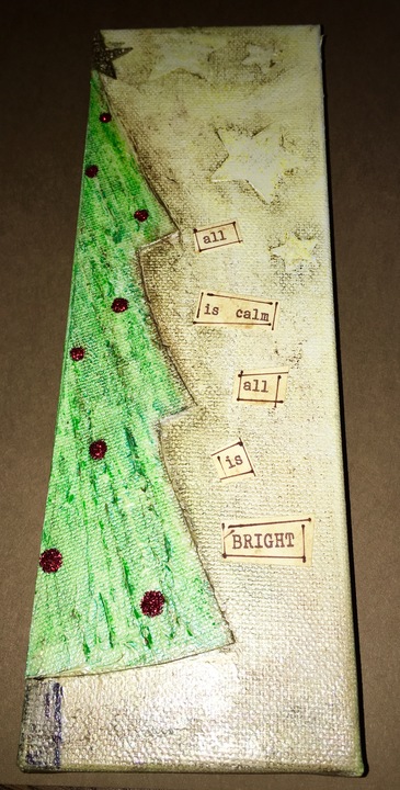
I received this cute canvas. I love the long orientation of it (3" x 9") and the way the artist used only half a tree.  The stars were added with modeling paste through a stencil and it looks like the texture in the tree is also modeling paste. It's hard to see in the photo, but the background is an elegant metallic gold paint. I love it!

Monday, June 13, 2016

DLP unPlanner - June

June Theme - Unraveling the Past: Embracing New Beginnings

Monthly Divider


For this month's divider I used the Bo Bunny June divider included in the kit and added kraft paper to the center portion of the front. I used the month calendar already printed on the back. The spine is covered with collage paper which I have continued throughout the planner. I used an "Art Pop" card from Robyn Marie Smith for a pocket for my tag which has the month's theme on it.


Weeks 1 and 2 - Weekly View Calendars

For June I printed all the weekly calendars on white card stock. For Week 1 I watercolored the background with a Distress marker. The dates are stamped on white paper squares and glued to half-circle collage paper stickers. Added some stamping, doodles, stickers and done!


I left Week 2 white but collaged bits of a floral napkin in some areas. The dates are written on pennants punched from the inside of a security envelope. I added some washi tape, stickers and stamping. Simple but done.


As you read this, I will be flying to Vermont for a week. My Mom's 88th birthday (Wednesday) coincided with my 50th (!!) high school reunion on Saturday so how could I not go - even though I'm still recuperating from our last trip! 

Then on Sunday I will fly directly to Austin to babysit my two grandsons for a week while their parents go on a cruise celebrating a friend's wedding.  So, this will be my last post for a few weeks...

Friday, September 18, 2015

Documented Life Project - Weeks 35 and 36

Catching up on weeks 35 and 36 since I was in Albuquerque babysitting Drew and Grant most of this past week.

Week 35 - Aug. 29

August Theme - Faces, The Human Form and Characters

Art Challenge: Self Portrait
Journal Prompt: Mirror, Mirror


Yikes, this month is really challenging! I must admit I never, ever would have done something like this unless challenged! I took my inspiration from Rae Missigman again who altered a photograph with a sketch app and then traced and painted the drawing.

I imported a cropped photo into the app, Pencil Sketch, on my phone and then printed it on my computer.  I then traced this the good old-fashioned way by rubbing the back of the copy with a regular pencil and then tracing over the lines on the front side with a stylus. This transferred the graphite to my journal page so I didn't have to draw "from scratch!"

I used Neocolor II watercolor crayons for coloring the drawing. The more I retouched it, the worse it got, so decided to leave it as is! At least I did the challenge, it looks like a person and somewhat resembles me!

After all that work, I was "done," so just drew random lines in the background and filled in with oversized journaling about the challenge.

I am so ready to move on from August and drawing faces!

~~~~~~~~~~~~~~~~~~~~~~~~~~~~~~~~~~


September Theme - Journaling with Photos

Week 36 - Sept. 5
Art Challenge: Photo Transfer
Journaling Prompt: From Here to There


For this week, I used a photo from the Internet which was a Life Magazine cover from 1957. I highlights a model in a Christian Dior dress in from of the Louvre Metro stop in Paris.  Since I spent a year studying in Paris in college (1968-69) I decided to use this photo as my focal point of the spread about how much life has changed from that point to now.

I started with a background of collaged book text, random papers and napkin pieces, then created layers of white, blue and ivory - adding and removing many times until I was happy with the result.

For the photo transfer I used a new transfer paper (TAP - Transfer Artist Paper) where you print your image onto the paper and then iron onto your surface.  For whatever reason, the image did not transfer well - I suspect my paper was old as it was a sample from 2011 and the directions say it lasts about 3 years :(  

So, I moved on to Plan B, using the gel medium transfer method. First I repainted over the area where the partial transfer was, then spread gel medium generously but smoothly in the same area. I used an inkjet print and laid it face down on the journal page, burnishing it well.  Some directions say to dry well, preferably overnight, but I couldn't wait, so used my heat tool to dry it thoroughly.

I sprayed water on the back of the paper and let it sit for a minute to soak in. Then I gently rubbed until all the paper was removed, leaving a reasonably clear transfer. (Transfers are never perfect and that is their beauty. I love the sanded, grungy effect.)

I added more paint around the transfer to integrate it with the background and also used many Paris-themed stamps. I also stamped a Tim Holtz quote, "Life is what happens to us when we are busy making other plans," and cut it apart.

Now to work on this week's challenge and, hopefully, get caught up!

Thursday, August 27, 2015

Documented Life Project - Week 32

August Theme - Faces, The Human Form and Characters

August 15 - Week 32
Art Challenge: Characters
Journal Prompt: "If You're Going to be Weird, Be Confident About It"

Is it just me or are the challenges getting harder? Or maybe this is just not my comfort zone! This is what I ended up with for Week 32 and, yes, it's kinda weird.


For the background I used some under paper that I liked (this is the paper I keep on my table to catch all the drips and wipe-offs when I'm working on a project - often they turn out really cool!) I didn't do anything to the background other than washing it with a light coat of gesso. The paper did not cover the full spread so I painted the left side and glued on a border strip and labels for the days of the week. The numbers are Tim Holtz Alpha Parts.

underpaper


I decided to collage a crazy character using the body
I decided to collage a crazy character using the body of an owl (image from the Internet), adding eyes from a woman's face in a magazine ad and red glasses and pink Doc Martens from the web.  For the legs I stamped Dyan Reaveley's funky tendrils stamp (lower left below), cut two of them out and colored with permanent pens.


I drew the hat and painted the stripes and polka dots. The title is also a Dyan Reaveley stamp which I cut apart and glued in place.  This is not my favorite page, but he is a character!

I will be back in a few days after we travel to Albuquerque to see two of the grands.

Sunday, July 26, 2015

Documented Life - Week 29!

July Theme - Ephemera

July 19 - Week 29

Art Challenge - Photographs and Memories
Journal Prompt - "All That I Have to Remember You" ~ Jim Croce


It seems that I have been using photographs and memories for the last few weeks' spreads, so I wasn't sure where to go with this week's prompt. In the end I was inspired by Rae Missigman's interpretation of the theme using a black and white photocopy of family members and then using ephemera, paints, stencils, mists, collaged painted paper circles for the background.

My father died in 1987 and I have always loved this photo of him. He was a painting contractor and carpenter and really knew his craft. We lived in a small ski resort town and he was well known for his impeccable skills. Many wealthy tourists built expensive vacation homes there and he was the contractor everyone demanded. Long before the days of Loews and Home Depot custom-mixing paint colors with a formula, he could do it by eye - tell him the color you wanted and he would mix it! I feel blessed that I inherited some of his color sense.


This is how the page started. I glued down ephemera - book text and strips of paint chips (a nod to his painting career) and some of Rae's painted paper circles I'd bought from her etsy shop.  Once that was all dry I started adding layer upon layer of paints, mists, stencils, stamps and doodles.  

It's a little hard to see, but I handwrote the title "remembering Dad" at the bottom of the right page. Around the photo I wrote adjectives that described the man he was (i.e. quiet, humble, loving, talented etc.). I also wrote his name at the top and along the left side his date of birth and death. He died just a few weeks after his 64th birthday - way too young - and I miss him every day. This is just a small tribute to this wonderful man in my life.